

How to Build a React UI Component Library: A Step-by-Step Guide using Shadcn UI, Vite, Tailwind CSS, and Storybook


Introduction
In this article, we will walk through the process of setting up a React UI component library using Shadcn UI, Vite, Tailwind CSS, and Storybook. But before we dive into the setup process, let’s understand what these technologies are and why we are using them.
Shadcn UI: It is a collection of beautifully designed and accessible components that you can use in your apps. It’s not a traditional component library that you install as a dependency. Instead, you can browse, copy, and paste the components, or customize them to suit your needs. We are using Shadcn UI because it allows us to quickly prototype and build components with a consistent design system.
Vite: Vite (French word for “quick”, pronounced /vit/, like “veet”) is a build tool that aims to provide a faster and leaner development experience for modern web projects. It consists of two major parts: A dev server that provides rich feature enhancements over native ES modules, for example extremely fast Hot Module Replacement (HMR), and a build command that bundles your code with Rollup, pre-configured to output highly optimized static assets for production. We are using Vite because it offers a faster and more efficient build process compared to traditional tools.
Tailwind CSS: Tailwind CSS is a utility-first CSS framework for rapidly building custom user interfaces. It provides low-level utility classes that let you build completely custom designs without ever leaving your HTML. It does not provide a series of predefined classes for elements such as buttons or tables. We are using Tailwind CSS because it gives us the flexibility to create custom styles easily and efficiently.
Storybook: Storybook is a tool for building UI components and pages in isolation. It helps you develop and share hard-to-reach states and edge cases without needing to run your whole app. Thousands of teams use it for UI development, testing, and documentation. We are using Storybook because it allows us to develop and test our components in isolation, making the development process more efficient and manageable.
Now that we have a better understanding of these technologies, let’s dive into the setup process.
Prerequisites
Before we start, I assume you already know the following:
React
TypeScript
Tailwind CSS
And make sure you have the following installed on your system:
- Node.js and npm
Step 1: Setting up the Project with Vite
First, we need to set up a new project using Vite (5.2.0). Run the following command in your terminal:
npm create vite@latest
Follow the on-screen prompts in the terminal and give your project name. For the purpose of this article we are using the name "ui-library". Since we will be using React and TypeScript, select the options accordingly.
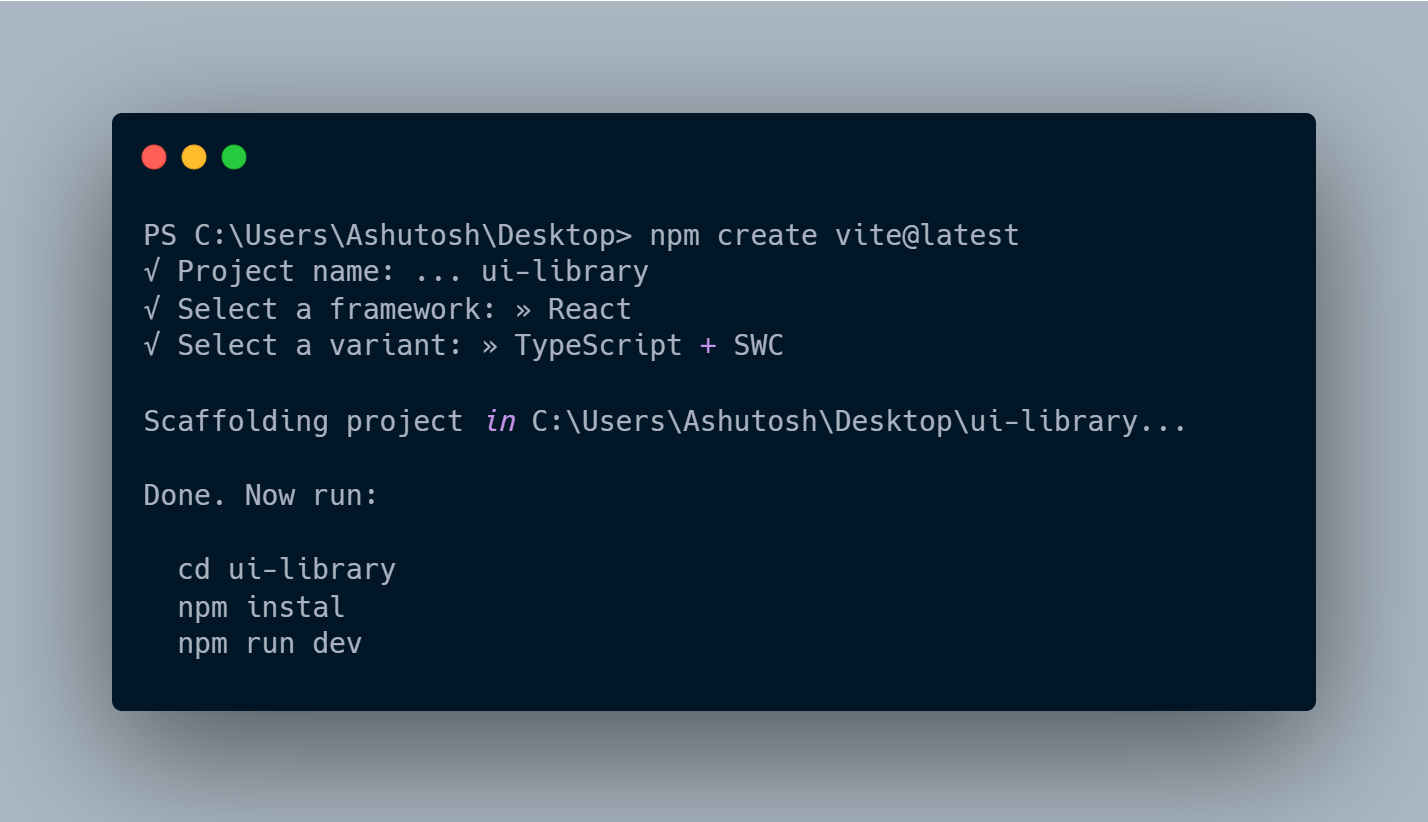
After following all the instructions, you should be inside the ui-library project directory and be able to see the Vite demo page at http://localhost:5173/.
Step 2: Installing Tailwind CSS
Next, we install Tailwind CSS (3.4.3) using the following command:
npm install -D tailwindcss postcss autoprefixer
Step 3: Configuring Tailwind CSS
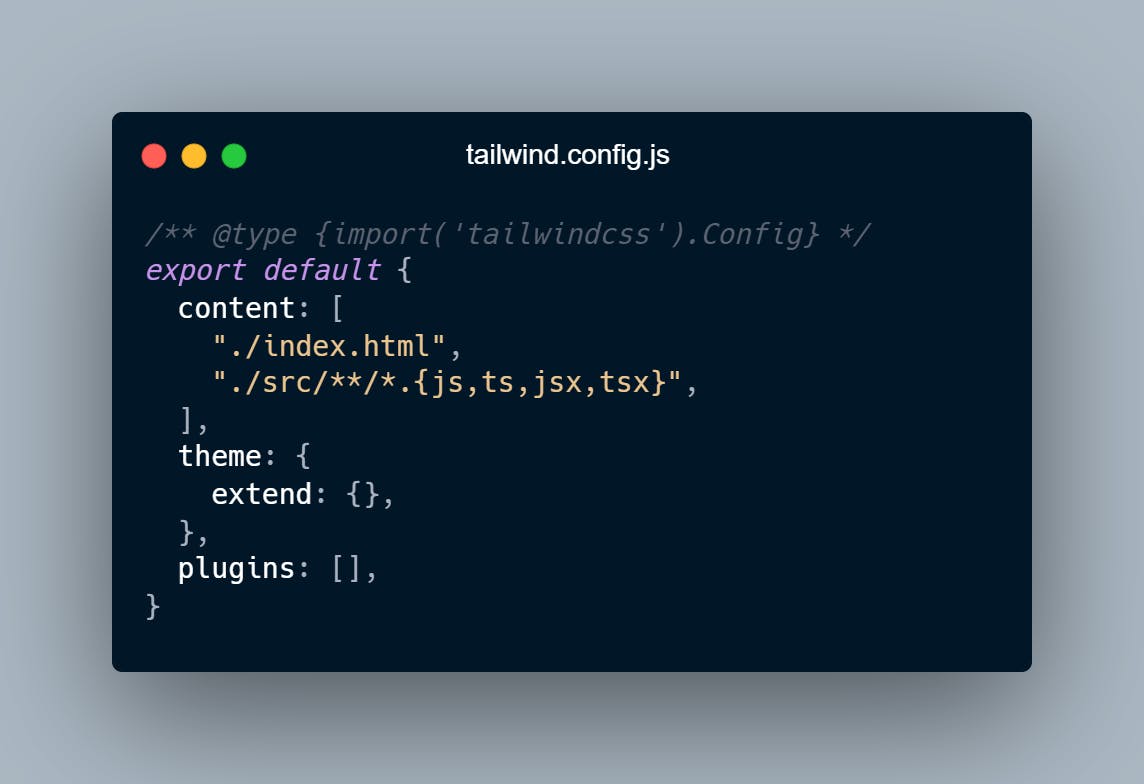
After installing Tailwind CSS, we need to create a configuration file:
npx tailwindcss init -p
This will create a tailwind.config.js file in your project root. Update the file as below for now for testing, since it will be get updated once we have shadcn installed:
Add the @tailwind directives for each of Tailwind’s layers to your src/index.css file:
@tailwind base;
@tailwind components;
@tailwind utilities;
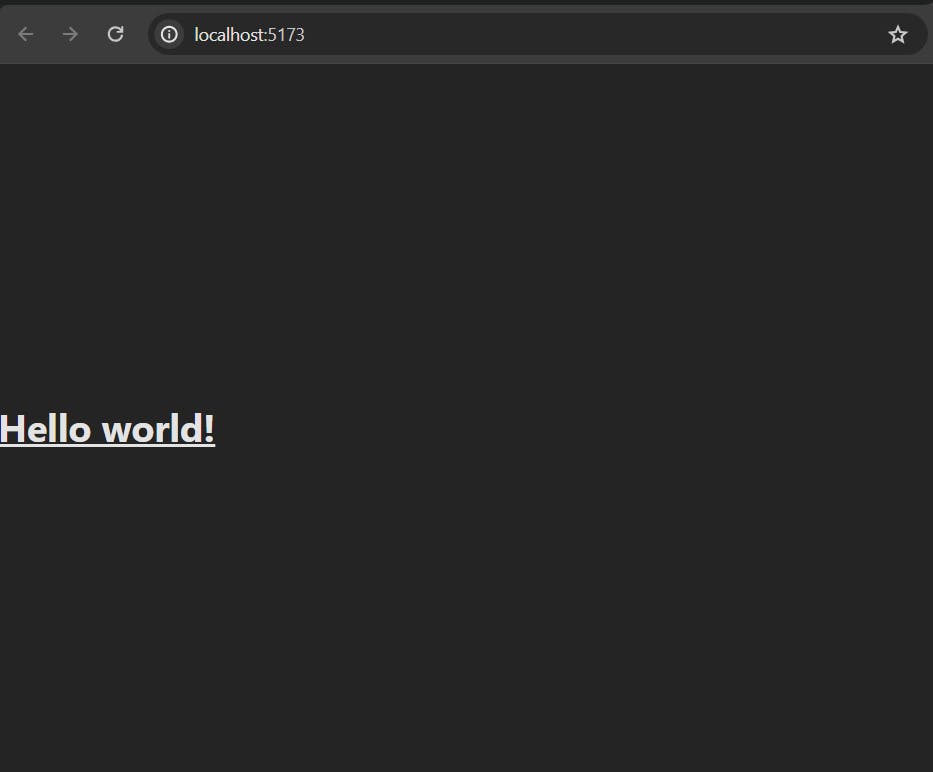
Replace everything in your App.tsx file with the following and run npm run dev:
export default function App() {
  return <h1 className='text-3xl font-bold underline'>Hello world!</h1>
}
You should see the following in the browser now:
At this point, we have a project with Vite and Tailwind installed.
Step 4: Integrating Storybook
Now we will be integrating Storybook 8 to develop our UI components in isolation and provide a clean documentation for each of those components. Install it using the following command:
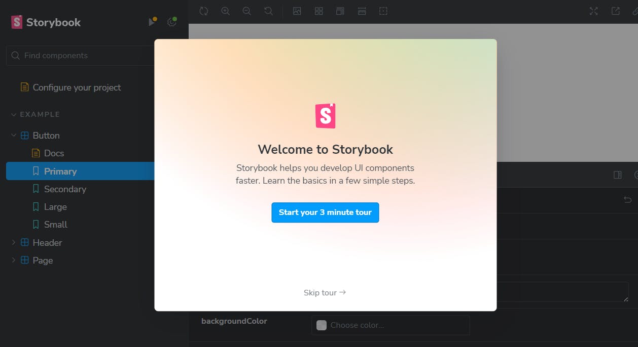
npx storybook@latest init
This command will automatically detect your project type and add the necessary dependencies and scripts to your package.json and you will see the below demo page at http://localhost:6006/:
For Tailwind classes to work with Storybook, we need to import it in the .storybook/preview.ts file:
import 'tailwindcss/tailwind.css'
Step 5: Installing Shadcn UI
Now we will be setting up Shadcn in our project, using which we will be creating our UI components.
Firstly, we need to add some code in compilerOptions of our tsconfig.json file to resolve paths:
{
  "compilerOptions": {
    // ...
    "baseUrl": ".",
    "paths": {
      "@/*": [
        "./src/*"
      ]
    }
    // ...
  }
}
Then we will install @types/node using the following command:
# (so you can import "path" without error)
npm i -D @types/node
Add the following code to the vite.config.ts so your app can resolve paths without error:
import path from "path"
import react from "@vitejs/plugin-react"
import { defineConfig } from "vite"

export default defineConfig({
  plugins: [react()],
  resolve: {
    alias: {
      "@": path.resolve(__dirname, "./src"),
    },
  },
})
Run the shadcn-ui init command to setup your project:
npx shadcn-ui@latest init
Choose the options as follows:
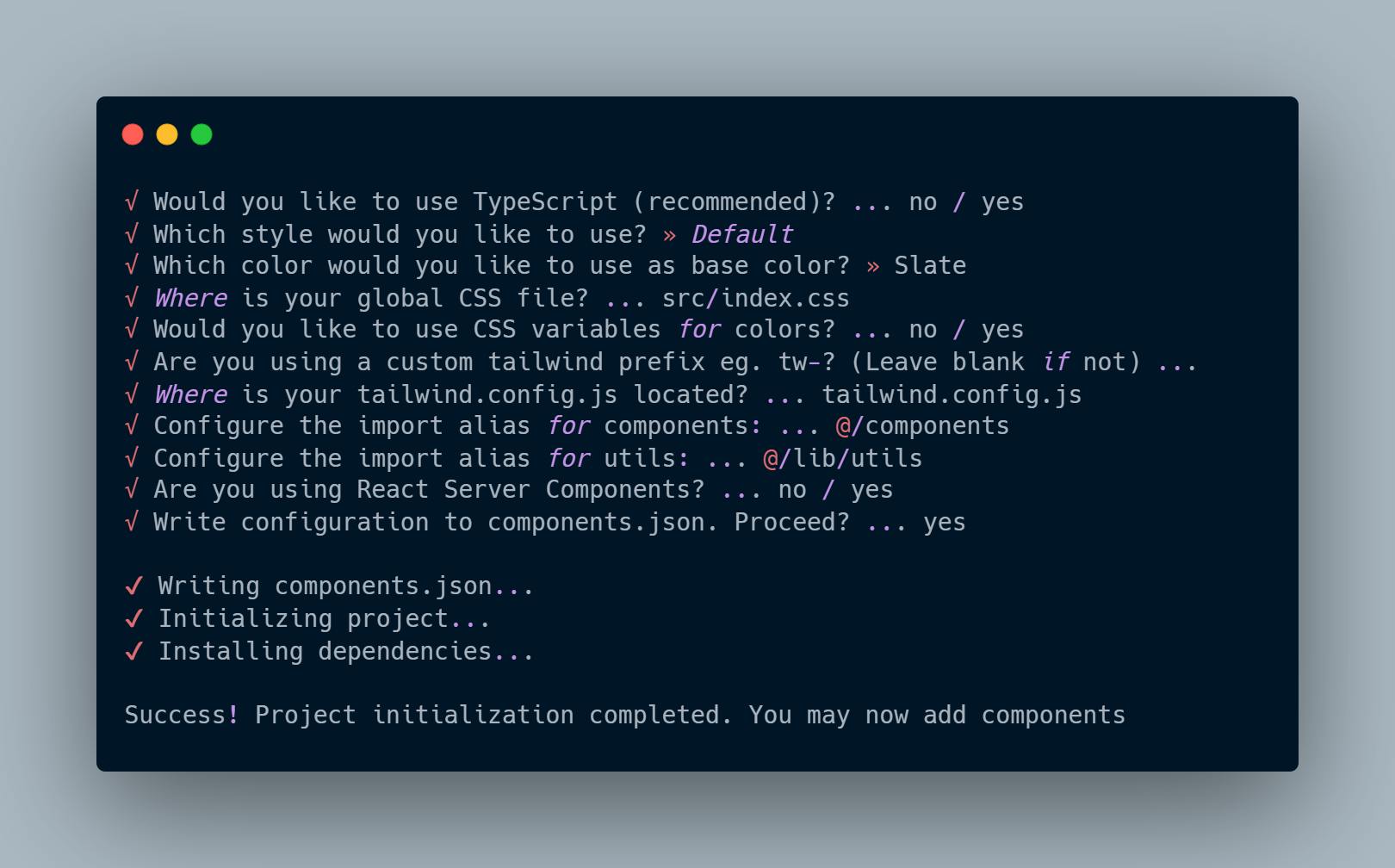
Now we are ready to add our first component.
Step 6: Creating a Component
Now, let’s create a simple component using Shadcn UI. The command below will add the Button component to your project:
npx shadcn-ui@latest add button
You can now import the Button component in your Storybook story or edit the component at src\components\ui\button.tsx
Step 7: Adding Component to Storybook
Finally, let’s add our Button component to Storybook. There will be an existing Button component created by Storybook, we can delete it along with other sample components. Edit file Button.stories.tsx in the src\stories\Button.stories.ts directory as follows:
import { Button } from '@/components/ui/button'
import type { Meta, StoryObj } from '@storybook/react'
import { fn } from '@storybook/test'

const meta = {
  title: 'Example/Button',
  component: Button,
  parameters: {
    layout: 'centered',
  },
  tags: ['autodocs'],
  argTypes: {},
  args: { onClick: fn() },
} satisfies Meta<typeof Button>

export default meta
type Story = StoryObj<typeof meta>

export const Primary: Story = {
  args: {
    children: 'Button',
  },
}
Now, you can run npm run storybook to start Storybook, and see your component in action at http://localhost:6006/. It should look something like this:
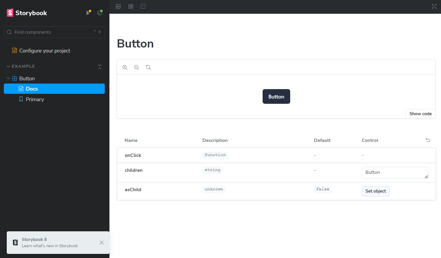
You can now go ahead and customize your Button component and add more shadcn components from here.
Conclusion
Congratulations! You’ve just set up a React UI component library using Shadcn UI, Vite, Tailwind CSS, and Storybook. This setup will help you create and manage your components efficiently.
Do give a like if it helped you and any feedback is appreciated :)